We use cookies to improve your experience on our website and for marketing. Private Policy.

Power BI Updates for March–April 2025: New Opportunities for eCommerce Analytics
April 17, 2025
Power BI Updates for MarchApril 2025: New Opportunities for eCommerce Analytics
Introduction
Every month, Microsoft releases updates for Power BI, adding new features and enhancements. These continuous updates mean that the platform becomes more user-friendly, faster, and smarter for data analysis. For business users in the eCommerce sector (specifically, Adobe Commerce/Magento users), this is an opportunity to gain more analytical capabilities without the need for complex technical configurations. In this article, well briefly review the key updates for Power BI Desktop and Power BI Service over the past month (Marchearly April 2025) and explain in simple terms what they mean and how they can be applied to eCommerce data analysis.
Key Updates (MarchApril 2025)
Below is a list of the key updates for Power BI over this period that can be useful for eCommerce analytics:
1. Faster Startup for Power BI Desktop and 64-bit Requirement
Developers have significantly sped up the startup time for Power BI Desktop the program now starts faster, so you spend less time waiting and more time analyzing data. Starting with the March release, performance optimizations are being rolled out gradually, so users will experience less lag when opening reports. Microsoft has also announced the need to switch to the 64-bit version, as the 32-bit Desktop will no longer be supported after July 31, 2025. Business users should update to the 64-bit version in advance and install the latest updates to benefit from all improvements and support.
2. Smarter Copilot (AI) for Data Analysis
The built-in artificial intelligence, Power BI Copilot, became even more useful in the March update. First, if someone sends you a Power BI report link via Microsoft Teams or Outlook, you can now see a "Open Copilot summary in Power BI" button next to it with one click, you can get a Copilot-generated summary of the report's content. This helps quickly understand key metrics without opening the report separately. Additionally, Copilot has improved its understanding of natural language in your data queries. It now recognizes synonyms, different phrasings, and even specific values from the data model allowing you to ask questions in your own words, and the system will better understand your query. For instance, if you ask, "What were the sales of product X last month compared to the previous month?" in either Ukrainian or English, Copilot will interpret your words correctly. Finally, Copilot now creates necessary measures on the fly, helping users generate new metrics for questions, even if those measures werent explicitly in the data model.
3. Annotations in PowerPoint Presentations (Preview) for Better Storytelling
For those presenting reports, a new feature in the preview allows annotations on data when embedding Power BI visualizations into PowerPoint presentations. Now, when inserting an interactive Power BI chart into a slide, you can directly add text annotations to specific data points on that chart. This means you can explain a sales spike or a dip in performance directly on the chart for example, labeling a bar with "Sharp increase due to Black Friday sale." The annotation is tied to the data point and will appear as long as the point remains visible on the graph (if you filter and the point disappears, so does the annotation). This feature turns reporting into a true data "storytelling" tool, helping to communicate the essence of metrics and the reasons behind changes.

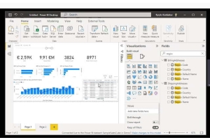
4. Improved Report Visualization and Formatting
Power BI developers have simplified the appearance settings for charts and cards in reports. Specifically, the ability to apply pre-built style presets to visual elements has been added. These style presets allow you to change multiple formatting parameters (colors, fonts, backgrounds) at once, instead of adjusting each setting manually. This saves time and ensures consistent styling across all charts in the report. Additionally, reference lines in visuals have become more flexible you can now easily add and adjust lines for planned values or averages. The new card type in preview mode has extended options for displaying categories and values, making metrics on dashboards more informative. These changes aim to make data visualization more intuitive and appealing without needing deep customization.
5. Easier Deployment and Navigation in Organizational Apps
Power BI continues to enhance organizational apps a way to combine multiple reports and dashboards into a single package for users. The March update added new options for configuring navigation within these apps. Previously, there were separate navigation panels for the app and for the pages of the selected report. Now, the "Combined navigation" option allows all report pages to be displayed in a single, unified navigation panel. This means users will see both the report list and the pages of those reports in one menu, eliminating the need to switch between two menus. For eCommerce companies creating a single dashboard for various departments (sales, inventory, marketing, etc.), combined navigation makes it easier for managers to find the necessary tabs and review data without confusion.

6. OneLake Data Hub: A Single Category for Business Users (Insights)
In the service portion of Power BI (within the Microsoft Fabric platform), a useful analytics access hub called OneLake Data Hub has been introduced. This centralized catalog contains data and analytical artifacts within the organization. With this update, business users now have a dedicated "Insights" category in the OneLake catalog, where all key analytics items of interest are gathered: reports, dashboards, organizational apps, and Fabric Insights (e.g., real-time dashboards, AI skills). This is essentially a "one-stop shop" for analytics users can easily find the reports or key metrics without wandering through different workspaces. For teams working with Adobe Commerce/Magento, this means quick access to the necessary reports (sales, customers, inventory, etc.) via a single interface, enhancing engagement with the data and speeding up decision-making.
Practical Application in eCommerce Analytics
So, how can these new capabilities help those involved in eCommerce analytics on platforms like Adobe Commerce (Magento)? Lets look at a few examples of how to apply them:
1. Quick Answers to Business Questions in User Language
With the improved Copilot, an online store manager can now get answers to ad-hoc questions without the need for an analyst. For instance, instead of manually building a report, you can ask the built-in AI, What was the gross revenue of the store in March and how much higher was it compared to February? Copilot will analyze the data model, possibly create a new calculation (growth percentage), and return the number with a brief explanation. Similarly, a marketing department head can ask, How many new customers placed their first order last month? or What percentage of sales came from the Electronics category? Previously, if the model didn't have a metric ready for these questions, the analyst would have to write a DAX formula. Now, Copilot will create the DAX query in the background and provide the answer in a user-friendly format.
2. More Visual and Understandable Reports for the Team
New visualization tools allow eCommerce analysts to convey information to colleagues in the clearest way possible. Using styling presets, you can make all the charts in your report match the corporate style (even if youre not a designer) with just a couple of clicks this leaves a professional impression on leadership. Adding reference lines allows, for example, to show the planned sales level on a chart and instantly see where the actual values are above or below the plan. The annotation feature in PowerPoint is especially useful for monthly reporting presentations: the eCommerce analyst can insert an interactive sales chart into a presentation for directors and directly highlight that the drop in February was due to the short month and the spike in March resulted from a successful spring campaign. Colleagues who may not be deeply involved in the details will immediately understand the reasons behind the changes on the graph, rather than just seeing the numbers.
3. Easy Access to Data and Reports for Different Teams
For large online businesses with multiple teams (sales, marketing, logistics) or several online stores, its essential to distribute analytics conveniently. The Power BI updates regarding Org Apps and the Insights catalog are designed specifically for this. Imagine that your company has created a set of dashboards: one for sales, one for customer behavior, and one for inventory levels. With an organizational app, you can consolidate everything into one analytics portal for employees. With the new combined navigation, the sales manager can easily open the app and see the Sales section with the relevant pages (e.g., Revenue by Category, Order Dynamics), while the logistics specialist will see the Logistics section with corresponding metrics. Theres no unnecessary switching and confusion everything is in one structure. Moreover, if your analytics team makes changes or adds a new report, they can first upload it to a test workspace, verify it, and only then update the app for all users. This ensures reliability: you get up-to-date data and new dashboards without disruptions or delays.
4. Scaling Analytics to Large Data Sets
As your eCommerce business grows, so do your data volumes (transactions, customers, products). This month, Power BI introduced Direct Lake technology (currently in public preview), which helps work with very large datasets in near-real time. For example, if you store detailed sales logs or web analytics data in a data warehouse
0 Comment(s)
Recent Posts


Featured Posts