We use cookies to improve your experience on our website and for marketing. Private Policy.

Creating a Shipments Time Analysis Report in Power BI
July 02, 2024

Analyzing shipment creation times is essential for optimizing logistics and improving overall operational efficiency. This guide will help you set up a Power BI report to analyze the number of shipments created per hour and per day. Follow these steps to create an insightful Shipments Time Analysis Report.
Initial Setup
Before you start, make sure you have the following:
- Login to Power BI
- Install Power BI Desktop
- Connect to the Dataset
Report Creation
1.Add a Relative Date Filter:
- In Power BI Desktop, go to the Fields pane and locate the Shipments table.
- Drag the Shipment Date column to the report canvas to create a visual.
- Click on the visual to select it, then go to the Visualizations pane and select the Slicer icon to convert the visual into a slicer.
- With the slicer selected, click on the dropdown arrow at the top right corner of the slicer visual and choose Relative.
- Configure the slicer to allow users to select relative dates (e.g., last year, last month, last 30 days).
2.Create KPI for Average Shipments per Day:
- In the Visualizations pane, select the Card visual icon.
- Drag the Orders Count field from the Shipments table to the Values area of the Card visual.
- To get the average, click on the dropdown arrow next to the Orders Count field in the Values area and select Average from the aggregation options.
Using DAX formulas:
- In the Fields pane, click on the New Measure button.
- In the formula bar that appears, type the following DAX formula:
AVG_Shipments_per_Day = AVERAGE('Shipments'[Orders Count]) - Press Enter to create the measure.
- Drag this new measure to the report canvas to create a KPI visual.
3.Create KPI for Average Shipments per Hour:
- Duplicate the Card visual you just created for average shipments per day by selecting it and pressing Ctrl+C and Ctrl+V.
- Click on the duplicated Card visual to select it.
- In the Visualizations pane, click on the dropdown arrow next to the Orders Count field in the Values area, select Show value as, and choose Division.
- In the Division settings, divide the average shipments per day by 24. Power BI will automatically calculate the average shipments per hour.
Using DAX formulas:
- Click on the New Measure button again.
- In the formula bar, type the following DAX formula:
AVG_Shipments_per_Hour = [AVG_Shipments_per_Day] / 24- Press Enter to create the measure.
- Drag this new measure to the report canvas to create another KPI visual.
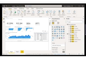
- Create a Timeline Chart with Shipments per Hour:
- In the Visualizations pane, select the Line chart icon
- Drag the Shipment Date column from the Shipments table to the Axis area.
- Drag the Orders Count field from the Shipments table to the Values area.
- This will create a timeline chart displaying the number of shipments per hour.
Steps in Detail
Filter for the Date Range:
Adding a relative date filter allows users to dynamically adjust the date range for their analysis. This is done by using the Shipment Date column in the Filters pane and selecting the relative date filtering option. The slicer visual allows users to select a relative time period such as the last year, last month, or last 30 days.
KPI: Average Shipments per Day and per Hour: These KPIs are created using Power BI's built-in aggregation features. The Card visual allows you to display average values without writing DAX formulas. For average shipments per hour, the Division setting can be used to divide the daily average by 24.
Timeline Chart: Creating a timeline chart involves dragging the Shipment Date and Orders Count fields onto the report canvas and then converting them into a line chart using the Visualizations pane. This visual representation helps in identifying trends and patterns in shipment creation over time.
Additional Resources
For users interested in creating custom DAX expressions in Power BI, here are some helpful resources:
Video Tutorial on Creating DAX Expressions: To learn how to create DAX expressions in Power BI, you can watch the tutorial available here. This video provides a step-by-step guide on writing and using DAX formulas effectively.
DAX Reference Guide: For a comprehensive reference on DAX formulas and functions, you can visit the DAX Reference. This guide covers all the essential DAX functions and provides examples of how to use them.
By following these steps, you can create a comprehensive Shipments Time Analysis Report in Power BI that provides valuable insights into your shipment creation times. This analysis helps in optimizing your logistics operations, improving efficiency, and making data-driven decisions.
This setup will allow your team to monitor shipment creation times effectively and make informed decisions to streamline your shipping processes. Stay tuned for more Power BI tips and tricks on our InsightsReady blog!
0 Comment(s)
Recent Posts


Featured Posts